William Browning, BED Colorado University, MSRED MIT, Hon. AIA, LEED AP, is the Managing Partner in Terrapin Bright Green, an environmental strategies research and consulting firm. Browning’s clients include Disney, New Songdo City, Lucasfilm, Google, Marriott, Bank of America, Salesforce, Interface, JP Morgan Chase, CoStar Group, the Inn of the Anasazi, the White House, and the Sydney 2000 Olympic Village. Browning was a founding member of the USGBC Board of Directors.
He is co-author of Greening the Building and the Bottom Line (1994), The Economics of Biophilia (2012, 2023 2nd Ed), 14 Patterns of Biophilic Design (2014, 2024 10th Anniversary ED), Human Spaces 2.0 Biophilic Design in Hospitality (2017) and Nature Inside, A Biophilic Design Guide (2020). His work has been featured in the Wall Street Journal, the New York Times, the Washington Post, Elle, Popular Science, and in segments by NPR, Reuters, CNN, and PBS.
Michal Matlon: How did you start your practice of biophilic design?
Bill Browning: I started a green building practice at Rocky Mountain Institute in Colorado in 1991. We were collecting case studies on early green buildings and seeing surprising gains in worker productivity. The literature at the time suggested these outcomes shouldn’t be attributed to the building itself, but rather to management changes. Yet, we kept finding more and more evidence that the buildings themselves were making a significant difference in people’s lives.
Eventually, at the end of 1994, we published a paper called Greening the Building, the Bottom Line. It featured eight case studies showing increased worker productivity in various building types.
Following that, we joined a group that secured funding from the U.S. Department of Energy to examine the effects of moving 700 factory workers from a windowless box to a new, daylit facility surrounded by a restored prairie landscape. This was designed by William McDonough for the furniture manufacturer Herman Miller. One of the researchers brought in to guide the process and set up the hypothesis was environmental psychologist Judy Heerwagen, a pioneer in the field of biophilia.
Judy introduced me to the concept of biophilia and suggested that if we observed productivity gains, they might be related to this. That was my introduction to biophilia in 1995. What we learned from the study was fascinating. We had a population of 700 workers, along with all their productivity and work data from the previous building. Over the course of a year in the new facility, we tracked their performance.
Halfway through the experiment, we were unsure if we’d see significant results because the data was inconsistent. However, it became clear after the data was separated by shift. The nighttime shift showed no gain in productivity, the swing shift data was mixed, and the daytime shift showed a significant increase in productivity.
For me, this was revealing. During the daytime, workers could see the restored prairie landscape, water, and other features around the building—things that weren’t visible in the old facility or during the nighttime shift..
Bill: And so, we started collecting every paper we could find on the topic, eventually categorizing them. Ten years later, this led to the development of the 14 Patterns of Biophilic Design.
Current Work and Projects
Natalia Olszewska: Could you tell us a little more about what you do? I read on your website about systems thinking and your discussions around ecology. What services do you offer, and what are you trying to achieve when working with your customers?
Bill: Our work falls into three broad categories. The first involves complex green buildings—unusual projects where clients want to address sustainability and green building issues. For example, three recent projects we’ve been involved in are just completed or nearing completion.

One is a 118-story tower in Malaysia, Merdeka 118 designed by Fender Katsalidis Architects. Two-thirds of the building is office space, the top portion is a hotel, and above that is an observation deck. We were responsible for all the sustainability strategies and the LEED certification for this building, which, two days ago, achieved LEED Platinum certification. This 300,000-square-meter building stands 227 meters tall, making it the second-tallest building in the world.
Another project is a small environmental education center designed by N Architects, for New York State Parks on Jones Beach, a barrier island. The center is about 300 square meters and combines net-zero energy systems with constructed ecosystems. It’s a fun project that explores the intersection of ecology and energy systems using biomimicry—innovation inspired by nature—as a basis for both the design and educational components.
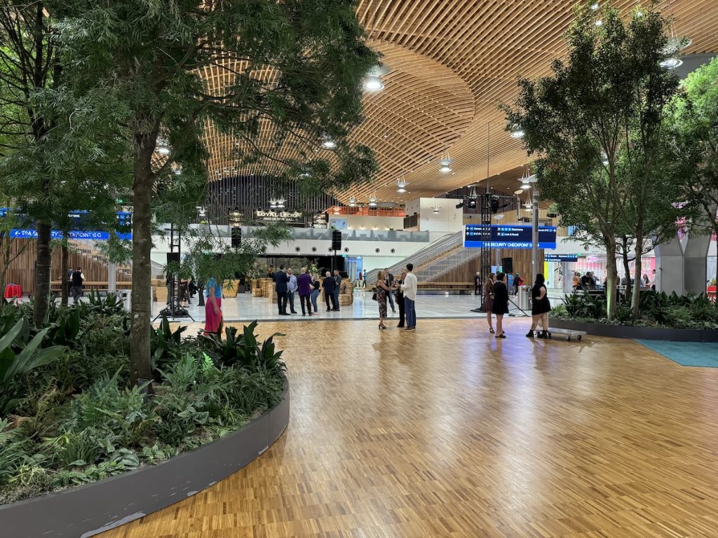
The third project is a reconstruction of the core terminal for the PDX International Airport designed by ZGF in Portland, Oregon. It’s a project with multiple goals. The first was set by the Port of Portland: they wanted an airport with design elements that would reduce passenger stress. This made biophilic design one of the original criteria for the facility.
They also wanted a building that celebrated Portland. The city’s history is deeply rooted in the timber and logging industries, which were foundational to its economy and the port’s development. The new building needed to reflect and celebrate Portland’s culture and history.
The project replaced a concrete structure built in the 1950s. For years, this airport had been one of the top-rated airports in the United States. However, the original structure was located in an earthquake subduction zone and was vulnerable to a potential Richter 9 earthquake, which could have caused the concrete roof to collapse catastrophically. Replacement and expansion were necessary.
The new structure features a 40,000-square-meter mass timber canopy that floats over the roof of both the original building and the expanded areas. During construction, the airport remained operational, so the canopy was built over the existing roof, which was then dismantled piece by piece and removed.
The design includes significant biophilic interventions placed strategically in areas where passengers experience the highest stress levels. The wood used in the structure was locally sourced—some from tribal and First Nations lands, some from private woodlots—and the glue-laminated beams and mass-plywood diaphragm were all manufactured locally.
Additionally, the wood sourcing incorporated enhanced sustainability practices, such as increasing the protection of riparian zones to safeguard salmon habitats and extending harvest rotations from 40 years to 60 years. The result is a structure that sequesters more carbon than was emitted during its construction. This represents a step beyond simply reducing the carbon footprint—it’s about creating buildings that actively sequester carbon.
Our work focuses on three areas: complex green buildings, biophilic design, and biomimicry (innovation inspired by nature). We approach this at two scales: designing individual objects and systems, and addressing broader ecosystems. For the latter, we ask: can our buildings replicate the ecosystem services and functions of the local environment? Essentially, can we create structures that are ecologically as effective as what nature would achieve in that location?
Our biophilia work spans several areas. One focus is continuously collecting scientific research—reading papers to understand the types of nature experiences being discussed and their outcomes for people. We analyze how people respond physiologically, emotionally, and cognitively and then categorize those outcomes.
We write and publish papers, sometimes independently and sometimes with sponsorship, and make them available for free on our website. We also collaborate with architects and building owners, providing design reviews to help implement biophilic design. While we are trained as designers, our role is to support other designers rather than act as primary designers ourselves.
Additionally, we write biophilic design guidelines for companies and brands to apply in their spaces. We also engage in direct experimentation and post-occupancy studies to understand whether people respond to spaces as intended and to evaluate the outcomes and implications of biophilic design measures.
The 14 Patterns of Biophilic Design
Michal: You mentioned the reports you publish, and personally, I think they’re an excellent resource. I always recommend them to others. We saw that you recently released an updated edition of The Economics of Biophilia, which explains the numbers and rationale behind biophilic design and how society as a whole can benefit. Given how clear the benefits are and the compelling evidence, why isn’t biophilic design the norm yet?
Bill: I think over time, it hopefully will be. For many people, it’s still a new topic. Although, quite frankly, one of the things we say is if you look at older buildings that people truly love and have maintained for centuries, there’s a reason for that. These buildings often have strong biophilic design components.
In a way, we’re helping to codify why people love certain spaces and providing explanations. We wrote The Economics of Biophilia, the original version, in 2012 because we were having conversations with potential clients about biophilic design. They’d nod and say, “Yeah, that’s really nice,” but that was where the conversation ended.
One of our partners said, “We need to get past that.” So, as we did with the original paper Greening the Building, the Bottom Line, we decided to explore the numbers and implications. If we could connect biophilic design to tangible monetary outcomes, it might get companies’ and developers’ attention. That was the foundation of The Economics of Biophilia.
We knew we’d eventually need to update it. Although we aimed for a 10th-anniversary edition, it took longer than expected. During the process, the paper expanded from 40 to 120 pages because there was so much more to discuss than in 2012. We also added appendices with tools to help readers run calculations themselves, allowing them to translate the results in ways others could understand.

We have also published another update, this time for 14 Patterns of Biophilic Design. It’s now 10 years old, and several things have happened since. Over the years, we’ve gained a better understanding of some patterns, so we’ll refine their definitions to explain them more clearly.
When we first wrote the publication, we worked with Google to develop biophilic design standards for their buildings. That collaboration included Terrapin, SERA Architects, researchers like Vivian Loftness at Carnegie Mellon, Judy Heerwagen, and Stephen Kellert at Yale. Together, we developed guidelines for Google.
At the time, we proposed an additional pattern that wasn’t in the original 14. Google’s rule was that if there wasn’t enough science, it couldn’t be included. So, the original 14 Patterns of Biophilic Design reflected the science we had at the time.
We categorize these experiences of nature in built environments into three broad categories:
- Direct Experiences of Nature – This includes sunlight, views of trees and landscapes, water, breezes, airflow, scents, sounds, and tactile experiences. It also involves observing changes in nature over time, creating a connection to the environment.
- Natural Analogues – These are representations of nature, such as biomorphic forms, natural materials, and complexity and order (often rooted in fractal patterns from nature). Research from institutions like the Salk Institute and the University of Oregon shows that these patterns reduce stress and enhance preferences for spaces.
- Spatial Experiences – These involve patterns like prospect (clear views and open space) and refuge (protected, enclosed areas). Prospect and refuge, defined by geographer Jay Appleton in the 1970s, are key to understanding why certain spaces feel safe and inviting. These patterns also aid in reducing stress, supporting wayfinding, and enhancing perceptions of safety. Other spatial experiences include mystery (elements that encourage exploration) and risk/peril (features like overlooking a dramatic drop, which can be exhilarating and trigger dopamine responses).
The original 14 patterns covered a range of experiences, but there was one spatial experience we struggled to define: the feeling of awe. It’s the sensation you get standing at the edge of the Grand Canyon, where your eyes widen, your heart slows, and your mouth drops open. Similarly, it’s the response when entering a grand cathedral, transitioning from a dark narthex to a soaring nave.
Only recently has neuroscience and experimental work explained this phenomenon, detailing the physiological and psychological cascade of responses following an experience of awe. In the updated 14 Patterns of Biophilic Design, we will include this as the 15th pattern.
Underutilized Biophilic Patterns
Michal: I wanted to ask, out of the 14—or now 15—patterns, which one do you feel is the most underutilized? Or which has the most potential that has yet to be fulfilled in practice?
Bill: One of my favorite and most underutilized patterns is the presence of water. It’s challenging to convince people to include water features in built environments because of maintenance concerns and expenses. However, the presence of water is psychologically and physiologically incredibly powerful.
It’s fascinating to observe the physiological and psychological responses to water in a space. We’re also intrigued by the psychoacoustic response to water. For instance, in noisy environments like offices or outdoor areas, while white noise is more acoustically effective, the sound of water—such as a small waterfall or babbling brook—captures our attention. It allows us to focus on it while screening out other sounds.
From a survival perspective, this makes sense. The savanna hypothesis, which is a foundation of biophilia, suggests humans evolved on the savannas of Africa and respond to conditions reminiscent of that environment. On the savannah, water wasn’t abundant, and the cleanest sources were small waterfalls, wells, or aerated streams. Humans are highly attuned to the sound of water because it signifies survival.
We can go almost a month without food, but only about 72 hours without water. When we hear the sound of water, we instinctively pay attention to it while tuning out other sounds.
The presence of water is psychologically and physiologically incredibly powerful.
Another pattern we find particularly valuable—especially in offices and workspaces—is the refuge experience. It’s often missing in open-plan offices. The ability to withdraw briefly and reset is crucial. This could be as simple as an Arne Jacobsen egg chair or a high-back booth.
If you think about classic restaurant design worldwide, high-back booths are common. Given the choice, would you prefer a round table in the middle of the room or a cozy booth? And if the booth is elevated on a small plinth, it provides both refuge and prospect—a view of the rest of the space while remaining protected.
When we conduct post-occupancy evaluations, we often find that refuge is the pattern most needed yet most absent. People don’t need refuge all day, but having a place to withdraw, even briefly, is essential. This experience can also be shared with small groups, like sitting in a booth with three or four people.

An example of applying refuge is Interface, an international carpet and flooring company based in Atlanta, Georgia. They are deeply committed to biomimicry and biophilia and were among the first companies globally to commit to zero carbon, and then to carbon drawdown. They also actively measure and create carbon-neutral products.
When Interface decided to build a new headquarters in downtown Atlanta, they prioritized proximity to public transportation—something rare for Atlanta’s office buildings. The building they chose was slightly smaller than they ideally needed, but its location and their biophilic goals made it the right choice.
They recognized that in a typical office, most desks remain unoccupied much of the time because employees are in meetings or traveling. The traditional approach of assigning permanent desks for everyone didn’t make sense. However, they also realized that “hoteling”—where employees are assigned a random desk each day—could feel disorienting.
Instead, they designed a space with some permanent desks, there are some people who do need that, but the vast majority of the population doesn’t. So, they created a building with spaces that feel like a library, study carrels, meeting rooms for two to twenty people, booths, niches in the walls, a grand staircase where you can sit and talk, and a roof garden with chairs and meeting areas.

The building has an enormous spatial variety, designed so people could move throughout the building all day long, using the space that best suits their needs at any given time. Just before the pandemic, we worked with Carnegie Mellon to do a post-occupancy evaluation of the building.
One extraordinary finding was that in a building of this size—normally accommodating about 100 people daily—they had 134 to 140 people using the space. People were actively moving around to the different areas, and the result was the highest level of user satisfaction Carnegie Mellon had ever measured in years of post-occupancy evaluations.
There were several biophilic components contributing to this. First, there were spatial patterns, including a great variety of refuge spaces, excellent prospect through the building and to the outdoors, and mystery. The stairwells were designed to hint at what was upstairs or downstairs, compelling people to explore further.
The roof garden featured aromatic plants that you could brush against, adding sensory stimulation, as well as a water feature. Inside the building, there were natural materials and plantings. The building’s skin was a floor-to-ceiling glass retrofitted with a material for energy efficiency and glare reduction.
Instead of using expensive ceramic frit, they wrapped the building in a plastic film typically used for bus advertisements. This film featured a reversed black-and-white photograph of a local forest. The tree trunks and branches appeared as clear areas, while the spaces between them formed a pixelated white pattern.
From a distance, it looked like you were viewing trees, streets, and more trees across the street. Up close, the pixelated surface formed a detailed statistical fractal, which is known to reduce stress. This design enmeshed occupants in a biophilic experience on two sides of the building.
Challenges in Implementing Biophilic Design
Natalia: Two questions. First, what’s your take on the reluctance within architectural practice to integrate more science in general? Second, I’m curious about your experience with finding clients willing to measure the impact of design on humans. I read a few years ago that only a small percentage of architects or real estate developers were interested in such measurements. How often do you find clients like that, and how do you manage to do so?
Bill: Unfortunately, we still have the “hero architect” mindset—the grand artistic vision where people say, “Don’t mess with my vision, don’t mess with my art.” We see this in some of the sculptural, blob-like designs from certain architects. However, there are others, like Thomas Heatherwick, who are genuinely interested in understanding how their work impacts people.
A significant challenge is that much of the science isn’t taught in design schools yet. That’s starting to change as more professors show interest, but the curriculum is often so packed—with structures, mechanical systems, and other essentials—that it’s hard to incorporate additional material.
What we’re seeing is that professors passionate about biophilic design integrate it into one of their design studios. That’s typically how it gets introduced into coursework.
A significant challenge is that much of the science isn’t taught in design schools yet.
Post-occupancy evaluation remains rare in architecture for a couple of reasons. First, it’s hard to find clients willing to pay for it. Second, many design firms don’t have the resources to fund it themselves. Additionally, the demands of completing one project and moving on to the next make evaluation a lower priority.
We’ve been fortunate to have clients who are willing to pay for post-occupancy evaluations. In some cases, certification systems like WELL or other green building standards require some level of post-occupancy assessment, which helps push the process forward.
Sometimes, we conduct post-occupancy evaluations that we can’t share publicly because clients view the results as a competitive advantage. While we’re always excited when clients undertake this process, it’s even better when they act on what they’ve learned—modifying or enhancing the space based on the findings. However, many companies prefer to keep this information private, and I can understand that perspective.
Benefits of Biophilic Design
Natalia: I’d like to return to the topic of how biophilic design and contact with nature impact buildings and people. We’ve discussed how these patterns improve productivity and reduce stress. But for those unfamiliar with biophilic design’s effects, can you summarize the benefits for the human body and mind? Beyond the economic advantages, there are also improvements in healing, reduced medication use in hospitals, and overall well-being. Could you briefly touch on those aspects, Bill?
Bill: Going through building types:
In hospitals, we see faster healing, reduced need for painkillers, stress reduction among hospital staff, and better retention of staff—particularly nursing staff, where stress-related turnover is both disruptive and expensive.

In schools, particularly for young children, biophilic design supports increased cognitive development, improved academic performance, and fewer behavioral issues. There’s also growing work around how biophilic design supports neurodiverse individuals, such as those on the autism spectrum. Oliver Heath in the UK has done great work in this area.
In retail, biophilic design leads to increased sales. In hospitality, guests are willing to pay more for rooms with great views, and hotel lobbies with biophilic features shift behavior. Instead of moving quickly through the lobby, people linger, which increases revenue from food and beverage sales.
In religious and civic structures, biophilic design fosters better prosocial behavior.
Health outcomes from biophilic design can be grouped into four broad categories:
- Stress Reduction – Measured through physiological indicators like heart rate, blood pressure, cortisol levels, and galvanic skin response.
- Improved Cognitive Function – Evaluated through various metrics.
- Enhanced Mood – People feel happier and experience reduced depression, including fewer depressive cycles and less rumination.
- Increased Prosocial Behavior – People become more charitable, humble, and community-minded.
We emphasize that while there are 15 patterns of biophilic design, it’s not necessary—or practical—to include all of them in a single project. Since different patterns support different outcomes, we use a narrative process with the design team to identify the needs of the people who will use the space. Are they stressed? Do they need cognitive support? Do we want to enhance their mood?
Evidence-based design guides our decisions. For instance, if evidence shows a particular pattern supports stress reduction, we’ll implement that pattern in areas where stress reduction is critical.
Take the example of an airport. A 40,000-square-meter space is enormous, and the budget doesn’t allow for interventions everywhere. So, we work with the design team and the client to identify where passengers experience stress.
There isn’t just one type of passenger. For example:
- A business traveler arriving by ride-share may skip ticketing, bag drop, and security lines with pre-screening. She’s familiar with the airport and only feels stressed at the gate, worrying about finishing emails before boarding.
- A family with young children experiences stress from the moment they arrive—parking the car, managing luggage, checking in, and getting through security. Their stress eases only when they reach the kids’ play area.
- Senior citizens, high school sports teams, and others have their own unique stress points.
We map these experiences, identifying stress points for each group. This creates a matrix highlighting where stress overlaps. Translating that into the floor plan, areas with significant overlap indicate where interventions are most needed.
At PDX, the Portland Airport, for instance, there’s a transition area after check-in and bag drop that leads to a retail space called the Marketplace. This area also acts as a portal between the old and new sections of the building and is the first place passengers encounter the security screening queues.
Bill: That’s a stress point, so the biggest intervention is right there. Overhead, there’s an amazing wood canopy with beautiful collinear patterns that are known to lower stress. A giant oval-shaped skylight sits over the transition area, and the edge of the skylight features wooden slats that come down slightly, creating a beautiful dappled light pattern on the floor. It feels like being in a forest, which is a great example of a statistical fractal that we know reduces stress.
The floor itself has ovals cut out of it, serving as in-floor planters. These planters hold full-sized living trees, ferns, and other plants. While the plants are tropical, they were specifically chosen to mimic the structure and look of a local native forest. As the Japanese say, shinrin-yoku, or forest bathing—you experience a bit of that as you pass through, complemented by the dappled light from above. That’s the most elaborate of all the interventions.
The next big intervention involves ceiling height. Most areas have ceilings at least 10 meters high, sometimes higher. However, in the security screening area, the ceiling is much lower due to a mezzanine above with conference rooms. As you approach security, there’s a large wall rising toward the top of the building. Rather than being a blank wall, it features giant LED screens showing long-rotation videos of nature—beautiful scenes from Oregon like Mount Hood or the Columbia River Gorge.
When you’re waiting in line for security, that’s what you look at instead of the chaos of the screening process.
After security, you’re usually disorganized—putting your shoes back on, repacking your bag, and so on. Most airports provide a simple metal bench for this, but here, that bench is transformed into something resembling a giant boulder with living trees growing out of it. You can sit surrounded by trees while you get yourself back together. That’s intervention number three.
The fourth intervention happens at a T-junction after more shopping. This is a decision point—do you go down one concourse, the other, or head to a restaurant? Here, tall windows offer views: on the north side, the Columbia River; on the south, forests. Overhead, there’s a suspended hanging garden with seating areas underneath.
Those are the four major interventions. There are others throughout the space, but these are the key ones.
Michal: I remember a conversation with a former colleague—an architect—and we were talking about biophilia. He said, “It can’t all be biophilic. We need minimalist buildings, dark ones, and crazy ones.” Often, people see biophilic design as a style or trend. But we know it’s something much more fundamental. What would you say to someone with that perspective?

Bill: I would send him to the chapel at the Massachusetts Institute of Technology in Cambridge, Massachusetts. It’s a small building designed in the 1950s by Eero Saarinen. It has no windows, yet it is one of the most biophilic spaces in the world. It’s a brick cylinder, made of chinker brick, so the brick is uneven.
Outside the cylinder is a small pool of water. Inside, there’s a second smaller cylinder, about waist height. Between the two cylinders, there are small arches on the exterior, and there’s glass between the inner and outer cylinders.
When the sun shines and there’s any movement or breeze, the water outside ripples, and the pattern of light on the water appears on the walls of the inner cylinder. The altar is a large block of marble, shaped like a shoebox, positioned behind it. Above it is an oval skylight, and under the skylight is an installation by sculptor Harry Bertoia. It features metal rods with small pieces of copper and other shiny metals attached.
As light comes down from the skylight, it creates a pattern on the installation. It’s an absolutely extraordinary space. It’s dark, has a sense of magic, and offers mystery. It features the presence of water, dynamic and diffuse light, fractal characteristics—and it has no windows and no plants. It’s made of brick, marble, travertine, and metal.
Enjoyed this article?
Support our mission with just €1! Your donation keeps our website running and supports the spread of knowledge about creating places that are good for people.